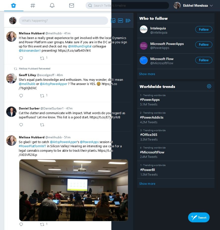
PowerTwitter is a pixel-by-pixel implementation of Twitter’s homepage in a canvas Power App.
- Application features:Full use of the Twitter’s connector
- Sentiment analysis using Azure’s Text Analytics API
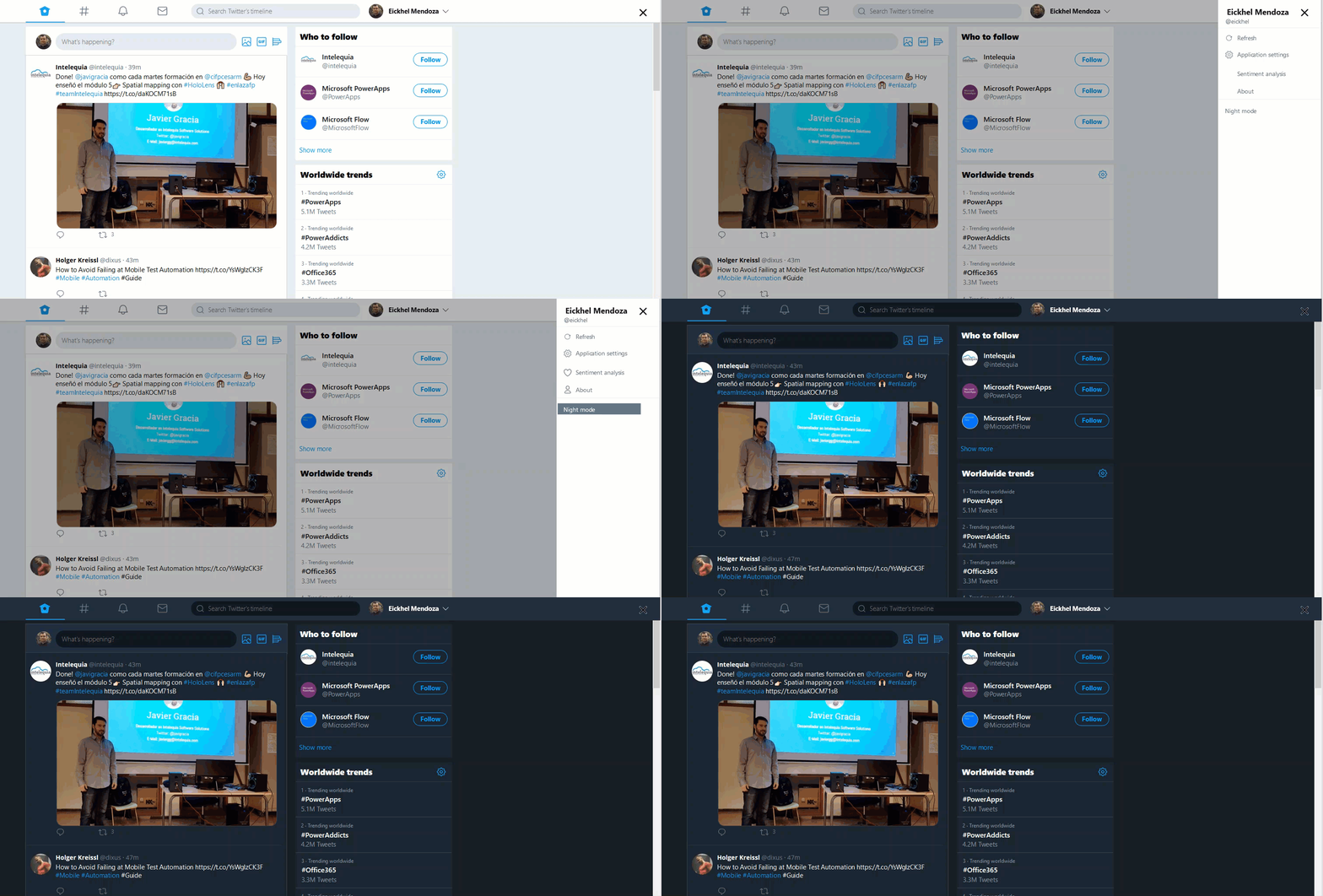
- Light and Dark themes
The idea behind this project was to showcase the many possibilities when designing user interfaces for Canvas apps. You can learn by example on how to create rounded user dialogs, display a shade for zoomed images / dialogs, handle theming of your app and explore the fully potential of the flexible height gallery.
User dialogs and shades for zoomed images
As in popular image editing applications as PowerPoint itself, Power Apps lays all screen elements as layers. Depending on the localization of an element in the screen distribution panel it will be on top or behind other elements of the same screen.
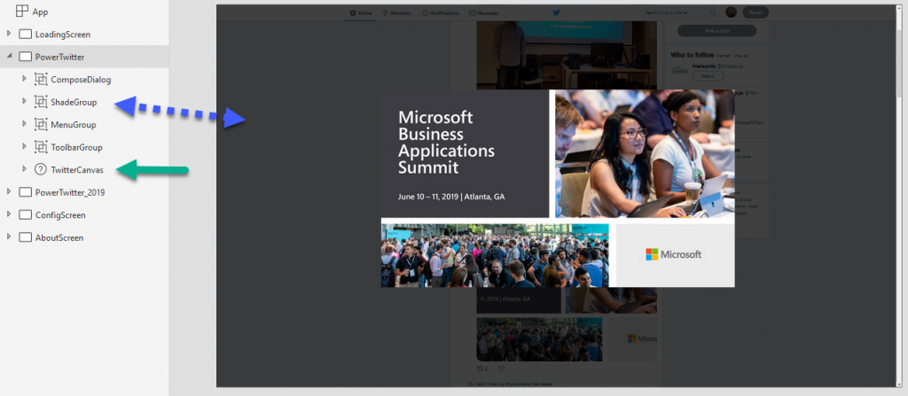
We could take advantage of this feature by hiding elements, and only making them visible when we need them, for example, to display confirmation dialogs or to create a shade for zoomed images.
Handling themes
Every control’s color attribute is defined inside their own properties. These attributes can be set manually or they can be linked to a variable. By linking them, we can have our own theme structure like so:
Set(
     CurrentTheme,
     {
         LightTheme: true,
         PrimaryColor: ColorValue("#FFFFFF"),
         SecondaryColor: ColorValue("#FFFFFF"),
         PrimaryTextColor: ColorValue("#14171A"),
         SecondaryTextColor: ColorValue("#657786"),
         BorderColor: ColorValue("#FFFFFF"),
         BackgroundColor: ColorValue("#E6ECF0"),
         DividerColor: ColorValue("#E5EBF0"),
         HeaderColor: ColorValue("#EFF1F2"),
         SearchColor: ColorValue("#F5F8FA"),
         HeaderSearchColor: ColorValue("#FFFFFF"),
         AccentColor: Blank()
     }
 );
Then, we could use this structure in each control color property:

Finally, we could change the whole application theme by just changing one variable.
Flexible height gallery
This type of gallery is a bit tricky to handle, but as it’s name implies, it’s a flexible solution for displaying data that might have different heights on a given gallery. Basically, It grows or shrinks depending on the contents. To accomplish this, we set it’s height based on calculations.
For example, when using a text label we can set the Auto height property to true for it to grow / shrink depending on the content. This suits well on PowerTwitter for the tweet messages or when the tweets have images embedded. For controls that doesn’t have the auto height we could use formulas like this to control it’s height:
If(
    !IsBlank(Image),
    600,
    0
)
Scrollable screen
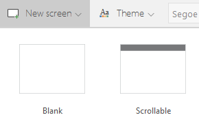
This fairly documented screen gives you the ability of having a whole section that scrolls independently of the main screen. This allows the creation of a screens that could, for example, have the need of a header section that is locked on top of the screen.
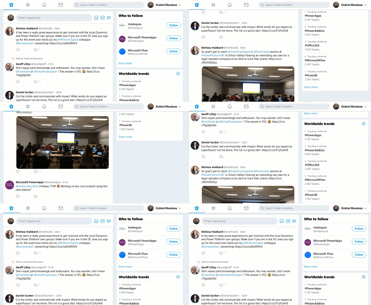
This screen automatically creates a canvas control ( Fluid Grid ) that scrolls independently from the main screen. As you can see in the following image, to simulate the scrolling mode of Twitter’s homepage we used this screen type:
This is just the surface of all the things you could learn or take as an example from PowerTwitter. I hope you like it, I really loved creating this Power App.
Want to take it for a spin? check out the repo on GitHub
